Case Study: Redesigning the Visual Systems in “Betrayal at House on the Hill”


Looking at Betrayal, I noticed that there were two key visual design issues that I wanted to address in the redesign. Firstly, there seemed to be a general visual system inconsistency spread throughout the game. Different elements of the game alternate between a multitude of different aesthetics. There are components that lean into retro sci-fi/horror movie posters and inky vectorized images, both of which somewhat clash with each other.
The other issue I identified was an overabundance with the actual game components, which may very well be contributing to this clash. The game itself involves exploring a haunted house with several of your friends, to find that later one of them is a traitor amongst you. From there, the core loop of the game and its tone both completely shift. There are over 50 possibilities for how the game will evolve from there, all of which pay homage to popular horror tropes. The vast replayability of Betrayal is at the core of its design, but this ultimately led to an excess of designed pieces that only apply to that specific evolution of the game. When approaching this redesign, one of my key goals was to make pieces that could behave somewhat universally to the different permutations that exist for the game.
I looked at the design of ouija boards predominantly to redesign the card. I felt that it maintained the elements of the supernatural I was trying to harken back to. My initial attempt at doing so yielded some less-than-successful results. I felt that I tried to hard directly replicate how someone would interact with a ouija board, making the numbers themselves curved and placing unnecessary ornamentation around the edges. The curvature of the number arrangement created some legibility problems, and made alignment a problem from thereon after.
As I took a second attempt at the character card, I made it a priority to keep elements of the grid in mind. I placed similar statistics in proximity with one another to remind players what stats were physically oriented vs. mentally oriented, as this comes up in the game quite often. Rather than explicity replicate a Ouija board design, I took smaller aspects of how a person would interact with one and applied it to the design. The four coffin-shaped tokens that existed in the original card were replaced with pointers that had holes at the center of them. These indexed to how someone might move around an actual Ouija board, with a piece that slid around the board highlighting different letters and numbers.
I placed the character portrait and their information at the center of the grid, similar to the original card. Additional ornamentation at the corners serves two functions: reflecting the tone of the game itself as well as highlighting the “color” of the character to visually distinguish each player.
Part of what I like about Betrayal as a social game is that it is almost reminiscent of telling scary stories around a campfire. Illustrations on the cards take a backseat to the narrative content of them, letting the players fill in the gaps in their minds for the story that is unfolding. There is a huge emphasis placed on the oral tradition of storytelling in Betrayal, and it was something I wanted to largely preserve. On each card I wanted to have illustrations of the event the card is referring to, but have these images act almost like cave drawings of what is being referred to. A singular vectorized image sits at the center of the card that acts in a supplementary manner to what is being read aloud.
The visual design of the cards were pretty sound originally, but I changed them a bit to fit with the visual system I had in mind. I kept the vectorized images intact that existed at the back of the card, and chose to add similar minimalistic images to the actual content of the card.
The card backs I tried to make visually distinct from one another with different colors for each, and utilized different vector images than the original that I felt more accurately reflected the content of the cards. The texture of the original Betrayal cards connote something spooky and mysterious, despite the fact that the muddy colors get in the way with visual distinction. With this in mind, I recognized that brighter colors leaned away with the centrality of darkness in the game but ultimately contributed more to clarity and player empathy as they try to organize these cards.
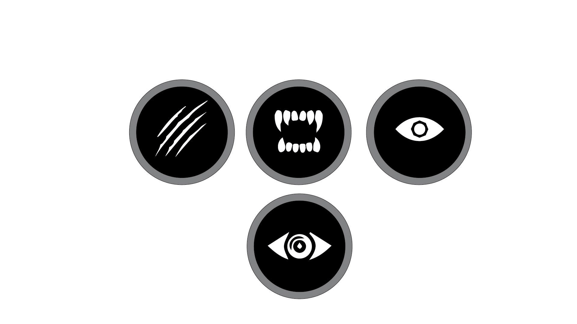
Redesigning the tokens of Betrayal was essential primarily because there were an absurd number of them in the original game. There were approximately 149 tokens to keep track of in the original game, many of them having a different design and a different functionality to keep track of. This made organizing the game troublesome for players, and led to many people opting not to focus on the tokens at all. While consulting those that avidly played Betrayal, many players admitted that they often choose to use a random token to represent a monster when the time comes, rather than deliberately finding the exact chip the game calls for.
With this in mind, I came to question the necessity of having so many unique components. I redesigned the tokens so that they could be applied universally to any monster, with different illustrations only slightly alluding to different horror tropes (monsters, slashers, supernatural entities, etc).
The backs of these tokens have a crystal ball with an “S” at the center, referring to their stunned state. I found the ball while looking up various cultish imagery, and really liked the overall aesthetic of it. I vectorized the image and put spaces between the fingers and hands. I tried to create almost a gestalt of the cult imagery, once again allowing players to fill in the gaps between spaces to imagine what’s there.